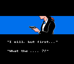
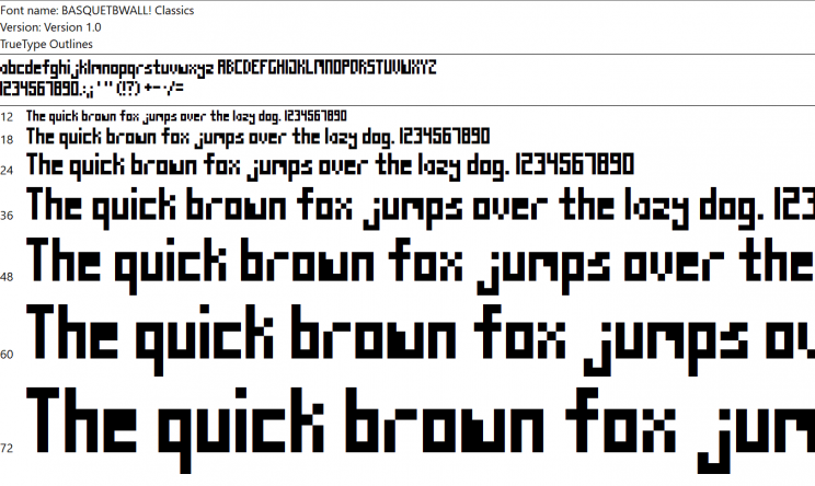
Within our first week alone, we’ve received several requests to use a different font in Basketball Classics. Not sure who designed that original font, but I’ll bet he is super cool, laid back, and doesn’t take reviews like that personally at all.
This article is for all you font fiends out there who really care about the nitty gritty of typefaces. The ones who relate to the designer Erik Spiekermann when he says, “I’m obviously a typeomaniac… I can’t explain it. I just get a total kick out of (fonts): they are my friends.”
So let’s take a look at some of my friends…
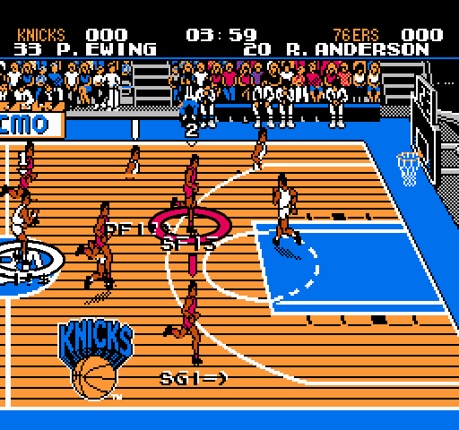
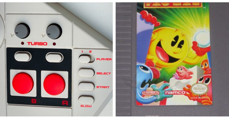
First, I’d like to make a quick study of some retro game fonts. Take a look at the season schedule for the masterpiece, Tecmo Super Bowl. It is wall to wall text.
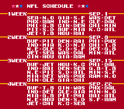
This font was clearly a NES default, used all over. It’s built on a 7px grid. Now look at the scoreboard displayed at the end of each match.
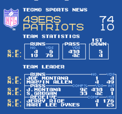
The information really is beautifully laid out here. There just isn’t much room for data rich stats. You end up with a good summary, but you really can’t dig into how each player performed at all.
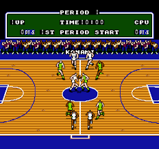
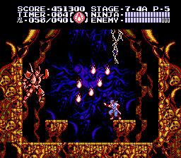
Looking at how some other games used typography, we can see how the on-screen real estate was often compromised. Did you remember Double Dribble using only 2/3 of the screen for the actual court? Maybe Ninja Gaiden was forced to over-use the “…” because dialogue was too cumbersome? Or did you really understand all that information at the top of the in-game screen?
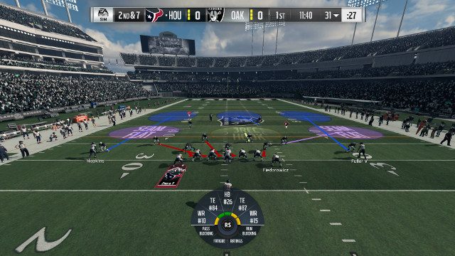
You can tell that using strict resolution, we simply wouldn’t have been able to display all the indicators and information that we felt was necessary for Basketball Classics. That is one major advantage that sports games today have over their predecessors. The ability to display more, and finer text information on screen. Here’s how some modern games use text:
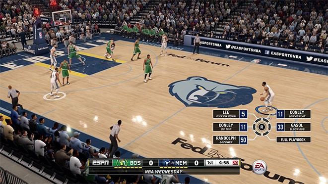
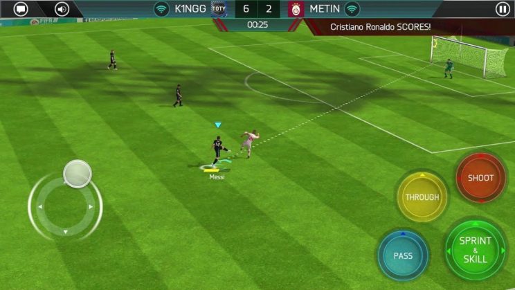
Being able to read player attributes on-the-fly is obviously a big deal in action sports, especially basketball. It was important to us to see at all times how good a player is at shooting for example, or if they are really the right person to chase down a fast break.
Using strict resolution is also vital to us though. One quick example of this is a zooming camera. Josh had spent hours getting the camera to zoom in on the ball during a shot, only to realize something felt off. We opted to leave it out because it breaks the retro resolution in an unnecessary way. With that said, we have had to make some exceptions. I mean, how would it look to have the indicators from 2K18 pasted onto the resolution of an NES game? A mess. That’s what it looks like.
Now onto our original typefaces.
The Namo Gamo Font
This is used on our company logo and only sparingly in the game. It’s typically used in ALL CAPS.
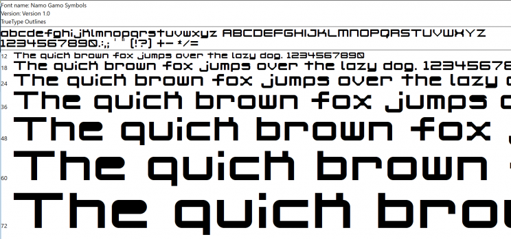
We used it sparingly mostly because it breaks the pixel grid structure with its rounded corners. It shows up on the Match Settings Screen and the Jumbotron. It is also used with the on-court player indicators, including the symbols. Like our name, it was inspired by a bunch of different retro gaming fonts. Mostly from the NES.
The Original Basketball Classics Font (BC1)
This is a pixel grid font. It is built on a 3px W x 6px H grid. We wanted to make a font that was small enough to fit into our true pixel structure (resolution), but still make it unique and legible. Then I decided to make it a little taller. You know, more of an Abdul-Jabbar type thing. Wilt the Stilt sort of style. A Nowitzki vibe.
Unfortunately, this turned out to be more of a Shawn Bradley type font if the reviews are any indication. Finally, bring on…
The Updated Basketball Classics Font
In an effort to make the font more readable, the pixel grid was opened up to a 4px W x 6px H size, with a 5px W exception for complicated letters and numbers.
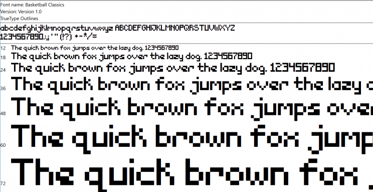
We hope that this change will improve the legibility while still maintaining the retro feel.