Some of you may have noticed that the cover art for Basketball Classics has changed; multiple times actually. Probably not the smartest move for brand recognition, but there we go again not being good at marketing…
Well I thought I might write up a little post talking about our process of making the cover art for Basketball Classics.
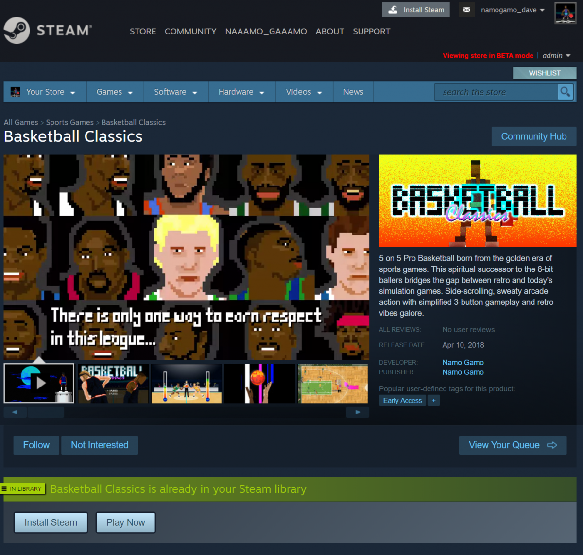
Steam Debut
The original cover was designed with this yellow/orange color, specifically with Steam’s storefront in mind. We wanted the colors to stand out against the soft blue background so we made this somewhat loud design hoping to get some attention.
One problem with Early Access is that you keep making significant changes to your game, but you are still trying to market it as you go. Well one of these transformations made in our game was the font. Also, the colors used in the game were strongly blue and pink, not yellow and orange. Lastly, our game is 2D with a decidedly retro aesthetic, so why show a 3D “bloxel” looking player on the front? I can hear my Jr. Jazz coach now “C’mon Pilk, get your head in the game!”. Then it would be back to the bench with me.
Attack of the Ghost Coach
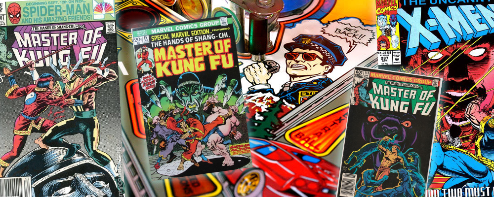
Our second attempt was based on our favorite early game covers. Here’s a few snippets of some covers we’ve been inspired by:
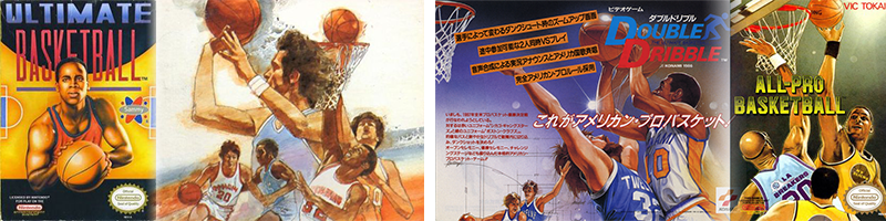
We mostly loved that collage look with realistic illustrations. We also wanted to include the paint textures used in Atari’s original “Basketball” cover. However, we wanted to use more neon colors to capture the electric feel and use that base blue that shows up so much in our game. So several months after early access release, we changed the cover to this:
The ghost coach cover seemed great and we were most likely going to use it throughout the life of the game. We made shirts and pretend game cartridges along with manuals, all featuring this cover. So why change?
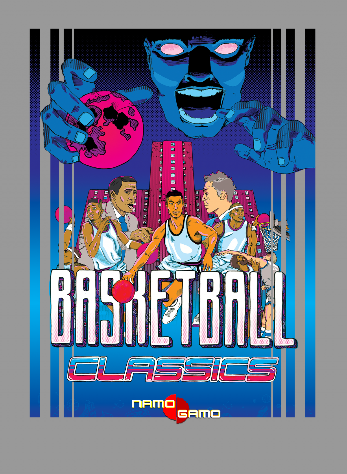
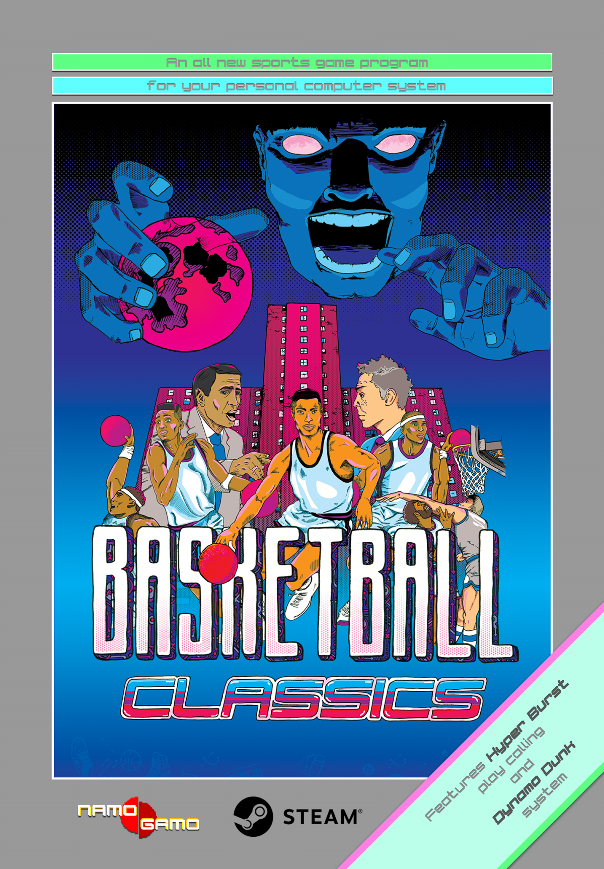
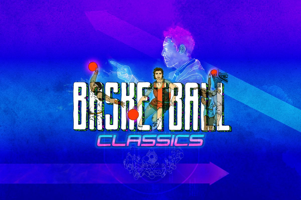
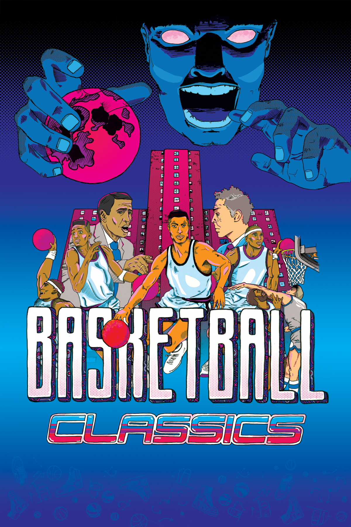
First of all, we wanted to somehow show that the game has been significantly upgraded and would now be ready for full release. We figured this might be a good chance to upgrade the cover as well. This time, we would want to show off more details that make Basketball Classics unique. Specifically the 5 on 5 team play, the street court, and head to head coaching. Most importantly however, we wanted to have a dramatic scene with a clear villain and hero that would reflect the story mode.
I wanted this new cover to look like my favorite retro comic books and pinball machines. This meant all the elements would be inked by hand and that we would use a limited color palette. I was hugely inspired by comic book covers, especially Gene Day’s Master of Kung Fu series. Also, I poured over my favorite pinball machines at our local arcade (faves have to be Terminator 2, the Getaway, and Star Trek 1991).
We are proud of how the final cover turned out. Several illustrations were put together into this collage and colored digitally with Photoshop. Hopefully we were able to say more about the game and the upgrades it has gone through as well. It feels like a milestone for us to attach this new cover to the final product. Let us know what you think!
Vertical cover 
Logo 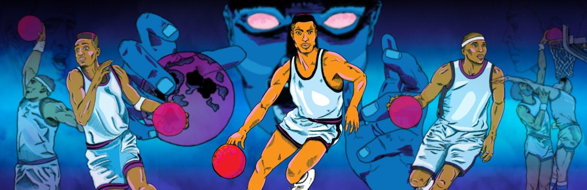
Steam Library Header 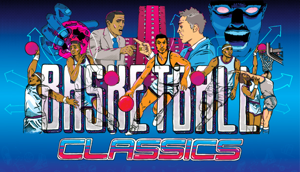
Horizontal Steam Cover